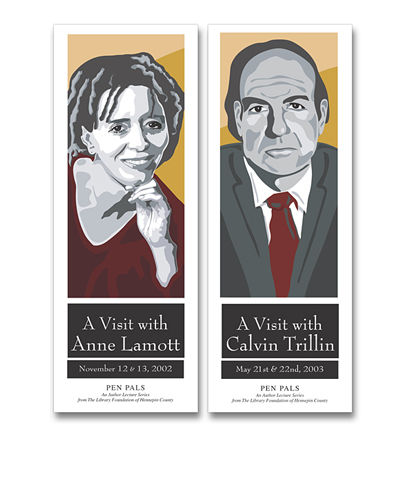
Illustration
Character Design
Jessie — Flagship Character Design
Created for Gillette Children’s, Jessie was developed as a scalable flagship character system — warm, expressive, and instantly recognizable.
The design emphasizes clean line work, controlled proportions, and clear emotional reads to ensure consistency across print, digital, and environmental applications. A structured pose library supports storytelling while maintaining brand integrity.
A flexible character asset built for long-term use, cross-platform deployment, and cohesive brand expression.


Illustration &
Apparel Design
A custom three-color illustration created for screen-printed staff apparel, centered on a bold, simplified gondola composition. Deep and mid-tone blues create depth, while clean silhouettes and white accents define snow and structure.
Engineered for efficient production, three inks are used with the garment color serving as the fourth — reducing cost while preserving depth and visual impact.

A Signature
for The Lake House
Created for a private Chicago residence named The Lake House,
the identity reflects architectural strength and lakefront restraint.
The skyline is distilled into a clean, vertically driven silhouette, where
disciplined line work conveys permanence and the subtle curved base
suggests shoreline and place.
A balanced pairing of serif and sans-serif typography positions the
mark as both timeless and contemporary — a minimal expression
of structure, setting, and sophistication.

A small town contest
I entered this poster into the Solon Beef Days contest fully expecting civic applause and at least one person to snort lemonade through their nose. It’s a gentle homage to Gary Larson—awkward livestock, earnest expressions, wholesome absurdity. A love letter to small-town fairs.
The response was… tranquil.
No ribbon.
No parade invite.
No strongly worded rejection.
For all I know, the entry now lives in a manila folder labeled “Talent.”
Still, no regrets. Comedy is a long game. Somewhere, I choose to believe one judge quietly smiled and thought,
“Well… that’s something.”

Another contest, what?
Emboldened by my previous competitive success,
I once again entered a civic “contest.” This time: city planning.
Thoughtful line work. Urban charm. Infrastructure with feelings.
A respectful amount of watercolored optimism.
We did not place.
We did not shortlist.
We did not trouble the judges.
But we did contribute.
Paint was used.
Markers were involved.